Like many tales in user interfaces these days, our story today begins on the web. In the early days before phones were “smart”, but did have web browsers, web sites for bigger companies would provide a mobile-friendly alternative accessible over a different URL, like http://m.somewhere.com. These would contain a handcrafted version of the main site slimmed and dumbed down to be readable and usable within the narrow confines of a phone screen. It took thought and effort to produce these, and even more to keep them up to date, so not many sites did it, and the web was on the whole a pretty unfriendly place for mobile phones.
Then came the iPhone and its imitators, which first exploded into their own space but then gradually started to displace computers themselves, and interest in providing mobile-friendly sites started to increase. Eventually people started looking for ways to reduce the maintenance burden of providing effectively two sites, and the technique of “responsive layout” or “responsive design” was born.
On the web the goal for a long time already had been to separate the content from the layout and presentation so the latter two could easily be changed, for facelifts or to keep up with trends. It was only a small step from there to make the layout dynamically adjust according to the screen size. Meanwhile mobile apps themselves were increasingly faced with the same needs, as manufacturers delivered phones with screen sizes increasing over time, and with the emergence of tablets. Apple, Google, and Microsoft all came up with their own approaches to this in their app UI toolkits, all similar to one another and based on stretchable UI components originally developed for desktop windowing environments.
The Problem
There is however, more to utilizing space than stretching and compressing. Imagine you have a one room house of about 10 feet / 3 meters square. It's a studio, you've got your kitchen along one wall, a foldout bed on another, and a little bathroom/shower stall in the corner.
Now say you inherit some money and decide it's time for something bigger. You hire an architect, agree on terms with a general contractor, and then sit back and wait for your new 1000 square foot / 100 square meter house to be built. Finally, the day comes when you move in, but when you do you're in for quite a shock. All that new space is there all right, but unfortunately there must have been some cock-up in the communication and there's still just one room. It's really quite cavernous except for the quarter of the house that's bitten out for the bathroom stall, now expanded to 15x15 feet. Unfortunately despite all this extra space they didn't install a Jacuzzi and sauna in it. Your kitchen is greatly expanded as well, which is good, but now you have to walk back and forth 25 feet to get something out of your refrigerator to put on the stove. But worst of all is the bed -- something must have really gone wrong there, since the 12 x 20 foot monstrosity you have now is more fit for a children's yard trampoline than a sleeping place.
So you call the architect and the contractor and complain, and they promise to fix everything. You return to your rental quarters for another 3 months, and then you come back, excited to finally live in your new house. But in fact things aren’t much improved. The bathroom has been shrunk down to normal size, and no longer takes up a quarter of the house. Likewise the kitchen now occupies just a corner and not the whole wall. Your bed is now a normal size and your existing sheets fit it. But that’s all there is. The rest is just open floor, oodles and oodles of it. No living room, no dining area, not even a couch or chair to enjoy the new space!

Upsizing isn’t easy! (Note: not to scale – the left floorplan is blown up 3x relative to the other two.)
A Failed Solution
While this is clearly a silly example for real life, it's unfortunately exactly what happens with many web sites and apps with so-called “responsive layout”. The point of failure is that, in a nutshell, “Bigger is different.” Just as phones had a hard time dealing with regular PC browser focused web sites (because smaller is different too), today tablets and PCs are suffering under the tyranny of the phone. Developers design for the phone screen because that's what a large proportion of their audience will use, and then tack on “responsive” layout which consists in little more than blowing up the screen they've designed for mobile. The result is very little content displayed for the screen size used, oversized text, often lots of blank space, and awkward jump-navigation where all context of where you are is lost.
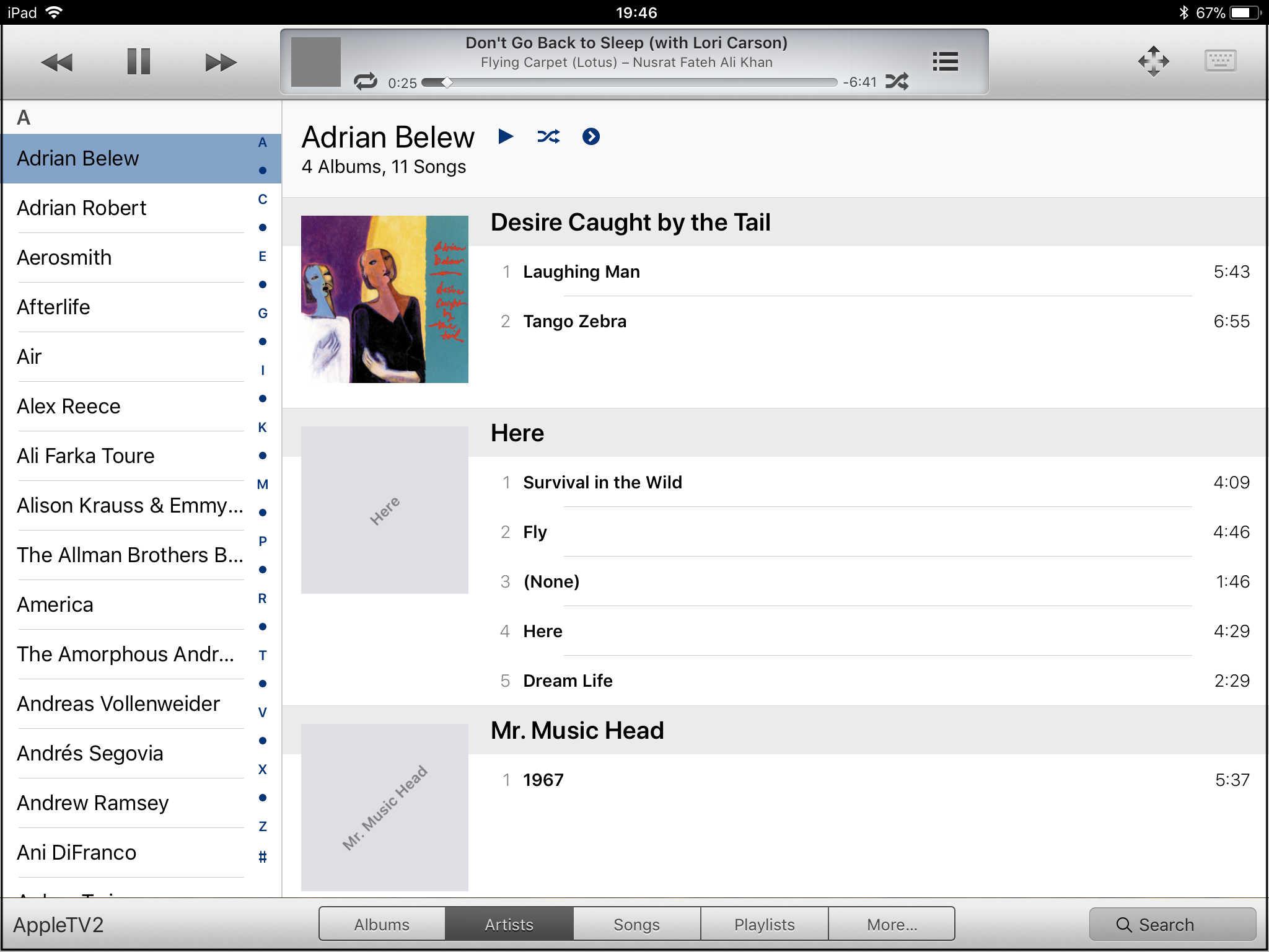
This actually wasn’t the vision Apple had when it developed its “auto layout” framework for mobile apps. Autolayout specifically includes the notion of “size classes”, which provide a way for the system to tell the app that it is running on a display which is wide and/or tall or narrow and/or short. The app can then make decisions what user interface elements to present and how to arrange them, still leaving to automation the lower level tasks of making sure the entire screen is filled with content and nothing is cut off. Unfortunately, in real life supporting size classes properly amounts to doubling or tripling the amount of work that needs to be done to deliver an application interface. Most people don’t bother. And that even includes Apple itself, which you’d think would have the resources to do the job. Here are two screenshots from their flagship Music app on the iPad, which was apparently designed for iPhone and supported on the iPad as an afterthought.
The left-hand side matches the second version of the enlarged house in our example above. The vertical display from the phone is simply rendered against the right side of the screen, and the rest is left blank. When the iPad is rotated to landscape mode as on the right, the “enlargement” method is used, as in the first version of the house. In neither case is the additional space on the screen used to display more of the song titles, which is what we would really want, or to display navigational information about the artist and / or the album we’re listening to.
All of this is a great contrast with Apple’s Remote app, which was made before the full array of responsive layout facilities was available in iOS and therefore received separate interfaces for phone and tablet each suited for the screen size.
What are the Alternatives?
So now we come to the “What can be done about this?” phase of the discussion, which is the most interesting because it can show us where we really are with software engineering tools and where we could go. Clearly responsive layout has accomplished something — it enables us to design once for the smallest display and scale it up automatically. By and large, this is an easier problem than scaling a larger display down, simply because a bad job is still usable, you can still see and interact with all the content, albeit inconveniently, as opposed to not being able to do anything at all with microscopic text or cut off images. But we still need to do essentially double the work to support multiple sizes properly.
One possible solution to this problem would be to move the design process to a higher level. Rather than specifying how elements on a page or in an app are to be laid out, we should specify how they relate to one another, and leave the physical arrangement to automation. Attempts have been made to build systems like this, especially in the area of data driven applications. The entire field of 4GL (4th-generation languages) grew up around this premise, but has never been able to gain much traction — at least partly owing to the poor quality of user interfaces it produces. It seems that to get a good UI you need to add a lot of detail for specifying the logical relationships that the automation system can use.
For example, suppose a web site for searching and ordering auto parts was being built. Rather than simply specifying that part X was part of models Y and Z, it’s also helpful to know that users when searching for parts aren’t likely to be interested in some sort of dual panel setup with a tree view containing all models, but would rather specify a model at the outset and then not worry about it after that. Thus, it’s not enough to declare that entity Part is a part of entity Model in the logical description, but also express the fact that the selection of a model in actual use tends to be a “sticky” attribute that does not need to be fiddled with very often and hence does not necessarily need to be on-screen.
A lot of effort was put into this direction at the beginning of the millenium, not for the purposes of user interfaces, but to provide enhanced search and automated facilities for connecting different web sites together. The idea was to transform the plain old web into a “semantic web” in which sites describe their contents and functions in a machine-understandable way that can be used to configure software and services indexing or utilizing them. Related efforts have and are being made in business-to-business communications, research and medical records, travel services, and more.
In every case, the problem has proven too difficult to lead to practical solutions. Every phase has been challenging. It is hard to come up with ways of describing content that are sufficiently flexible to cover all situations without incompatible extension. It is hard to build systems that “understand” the descriptions, and can automatically configure user interfaces or automated functions in response. It is hard to get people to agree on and use the approaches that are developed as standards. And meanwhile, in certain domains other methods proved more effective.
Searching the web is one of these areas. For example, if you’re searching the web for coffee makers, you are probably interested in a certain function, perhaps buying one, or maybe reading a review, or perhaps just reading funny stories about when they malfunction. In the “semantic web” vision you would enter two terms onto your search page: “coffee maker” into the ‘what’ field, and “reviews” into the ‘what about them’ field. Pages that labeled their contents as being reviews of coffee makers would then come up. But it turns out that a similar effect can be achieved without the semantic part, simply by collecting data on which pages have the words “coffee maker” and “review” and which other pages with these same words link to them. Typing “coffee maker reviews” all into one field then finds the desired pages straight off. The “semantic web” is still there, but it’s implicit in the system of links that the authoring humans have chosen to make.
Now many web sites and applications collect a great deal of data on how users behave — where they navigate from and to, how long they spend in certain areas, and what sequences they tend to follow. It isn’t a stretch to imagine that this information could be utilized somehow, not by humans trying to redesign the software or site, but by a system that automatically reacts to make oft-navigate paths shorter, present views often switched between together, and so on. This approach has been tried in limited ways by Microsoft, with dynamic menus, for example, but the results have not been impressive. It might be that now, with vastly greater data collection and machine learning capabilities, it’s time to take a second look.