
We had a few simple goals in mind when we set out to create Typefinity Keyboard. We wanted to bring a laptop-style keyboard layout to the iPad, because switching to an iPhone-inspired alternate layout to type a number or punctuation was just painful when working with a keyboard area roughly six times as large as a phone’s. (We later actually brought Typefinity to the phone as well since they have grown much larger since.) We wanted to add arrow keys, because none of the various videogame-like ways Apple had devised to move the cursor around in text were anything but frustrating. And we wanted to allow typing shortcuts like ⌘-c to paste or ctrl-e to go to the end of the line. Just a few things that those who prefer using the keyboard instead of the mouse as much as possible on computers would appreciate.
It turned out that neither the Control nor Command keys were possible, because it never occurred to Apple that an on-screen keyboard might want to provide these keys and therefore they didn’t provide any way for the keyboard to tell iOS that such a key had been pressed. 😐
As an afterthought we did include an option key (⌥) and had it access an alternate layout containing symbols and accented characters. Such a layout comes “out of the box” on every Mac and is often useful for typing names from foreign languages, parts of mathematical equations, and special symbols. Many users are familiar with option-8 to get a bullet • for example. Since Typefinity’s philosophy was to bring familiar layout from the laptop to the iPad, we copied this “option layout” straight over, in its own unique form for each language we implemented.

Mac Opt Layout, US English
We didn’t stop to question where these layouts came from or how useful they really were to users. We assumed they, like the design of the main keyboards themselves (“qwerty” for English, “qwertz” for German, “azerty” for French, etc.), were the result of historical development that had hopefully led to something useful.

Qwertz Layout (German)

Azerty Layout (French)

Opt Layout, German

Opt Layout, French
But what you’ll notice is that, besides a smattering of Greek letters, a couple of accent keys, and some common symbols like €, ®, ™, and ©, most other keys are rather useless. Some users called us out on this, but besides having many other priorities such as delivering competent autocorrect, we were reluctant to “innovate” here. Despite the obvious uselessness, we obstinately stuck with our philosophy that the traditional layout must be that way for a reason and we don’t want to mess with it.
Fast forward several years and we finally saw the light and decided to do something for Typefinity 2.0. We started with the sensible goal of providing the useful keys and dropping the useless ones. We also decided to dispense with “dead” accent keys, the ones where you first type the accent and then the character you want accented. This is actually slower than using the onscreen key popups and we couldn’t see any reason to preserve them. (We dropped these from the main layouts that had them as well.) Finally we wanted to make the opt layout uniform across languages so that users who switch between them wouldn’t be thrown off. This last goal proved tricky because users do rely heavily on parts of the existing opt layouts in Europe, where they are needed even to get to “ordinary” symbols like @, /, or [ ]. We ended up compromising by preserving some of these common mappings (which are mainly on the number row) and doing swaps elsewhere to avoid duplicating keys. The results for US English (and largely for other languages as well) were:

Opt Layout, iPhone
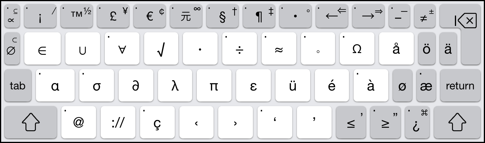
Opt Layout, iPad

Shift-Opt Layout, iPhone

Shift-Opt Layout, iPad
The upper left is focused on mathematical symbols, the middle row on the most commonly used Greek letters, and the bottom center/right on quotation marks. Common accented characters in major European languages are available – should the user prefer to type them without popups – on the right. Currency and footnoting symbols occupy the middle of the top row, while the top right side on the phone picks up characters that have their own main layout keys on the more spacious iPad, which uses this space instead to throw in some additional symbol and logical operator keys.
It took quite some time to come up with this design and optimize it, but it was exciting to be designing a keyboard layout from scratch, and we hope our work may even inspire developers of Mac and other operating systems to rethink their option layouts in the future.
Note, there are certainly choices one could quibble with, for example why approximate equals ≈ but no ± on the phone, or why not logical and/or ∧ / ∨ instead of double and single arrows on the iPad? Rather than agonizing endlessly over these choices, we hope users will tell us what they prefer. If you’re reading this and have an opinion, please get in touch via our support web site. We hope to hear from you there – and happy typing!